
The Brief
I was approached by the Directors Guild of Canada, to help create a logo for their workplace harassment reporting system. We wanted to create something that was strong enough to stand up to a serious issue, but soft enough to not feel imposing and make users feel comfortable and safe.
The Audience
DGC Members who experienced workplace harassment.

The Solution
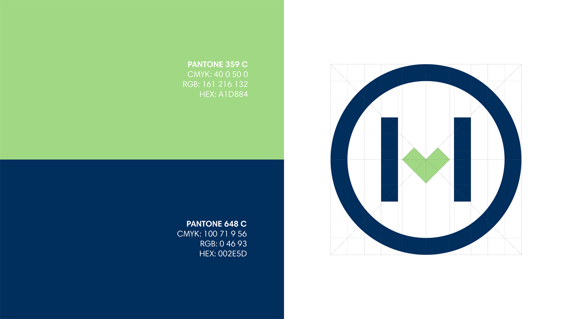
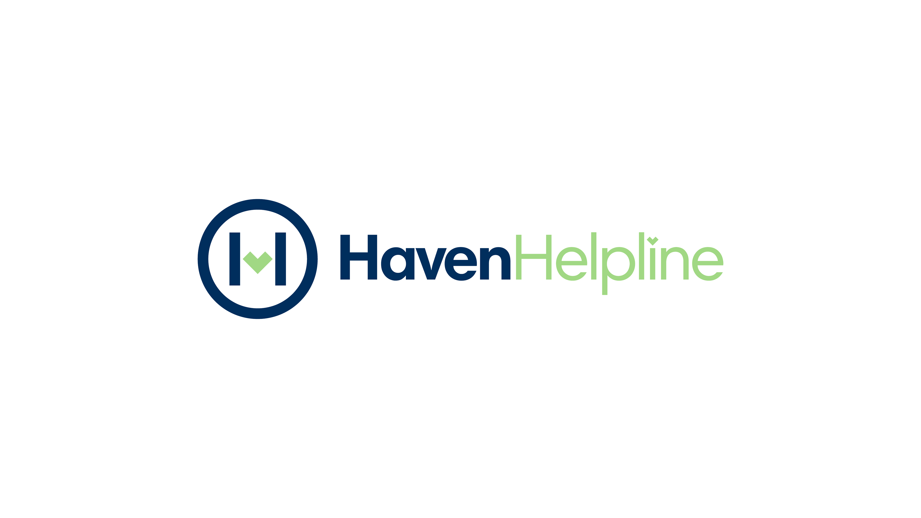
I knew early on that I wanted a heart to be the centre of the logo design. Something that very clearly stated that the organization cares very deeply for the health and safety of their membership. So, using that as the guide, I created an "H" design with the heart in the centre and the two pillars protecting it.
Finally, there is an optional circle frame which can be used to further add an air of safety and comfort to the overall mark. Although the design is created to work both with and without it.
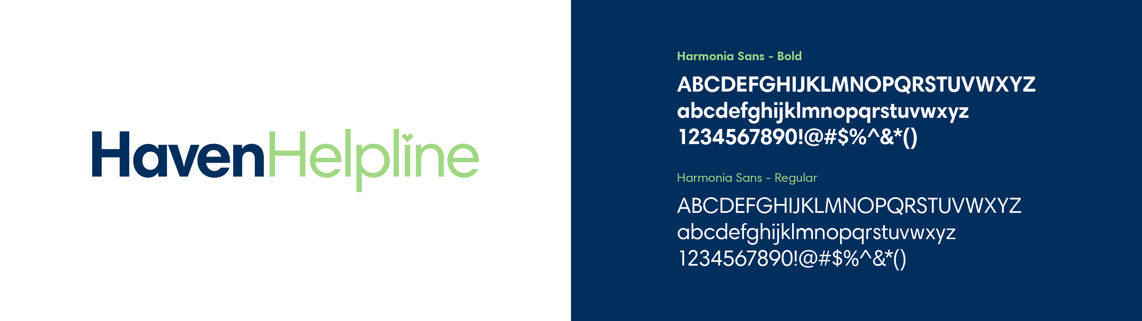
The colour story might seem counter-initiative, but we wanted to stay away from the violent connotations that a harsh red might bring so we settled on some cooler tones for the heart and framing elements.