The Brief
When it was time to re-launch the SYPE brand and bring in more people, the executive team spoke about inspiring new businesses to get involved. We wanted to create an easy and clear visual mark that spoke to the journey of young business people and helped drive new membership.
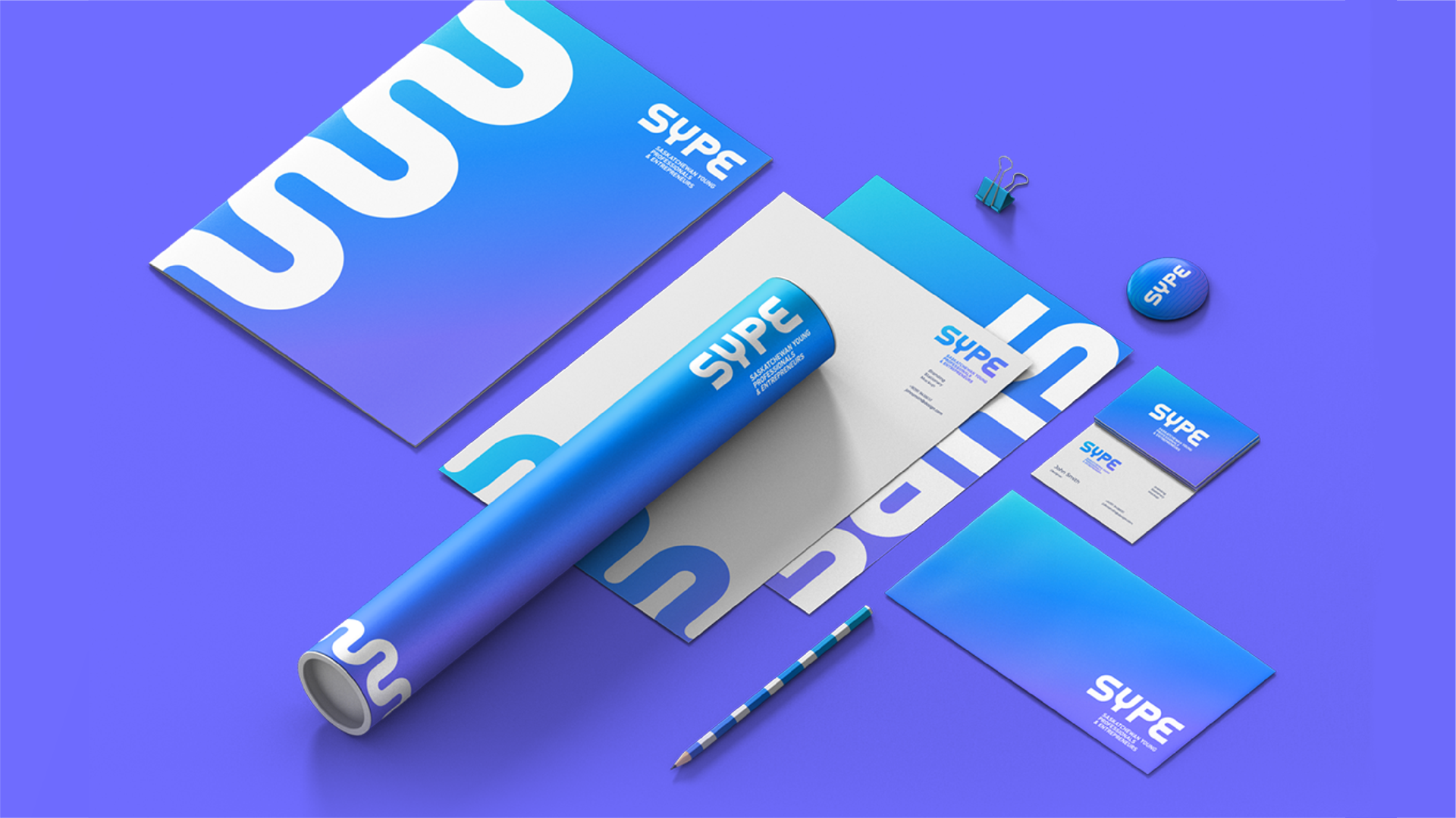
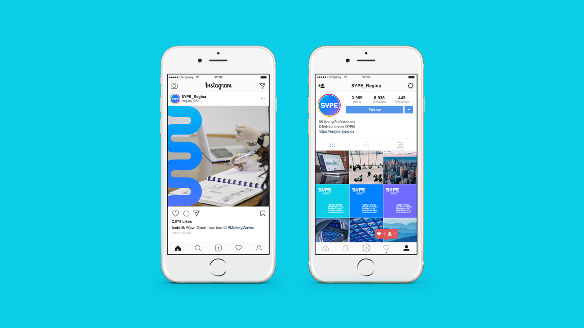
In addition to that, it was important that the new look was also versatile and could support a move to a more digital-savvy audience. This meant the design needed to work across as many mediums as possible.
The Audience
Young entrepreneurs focussed on keeping Saskatchewan vibrant and competitive.

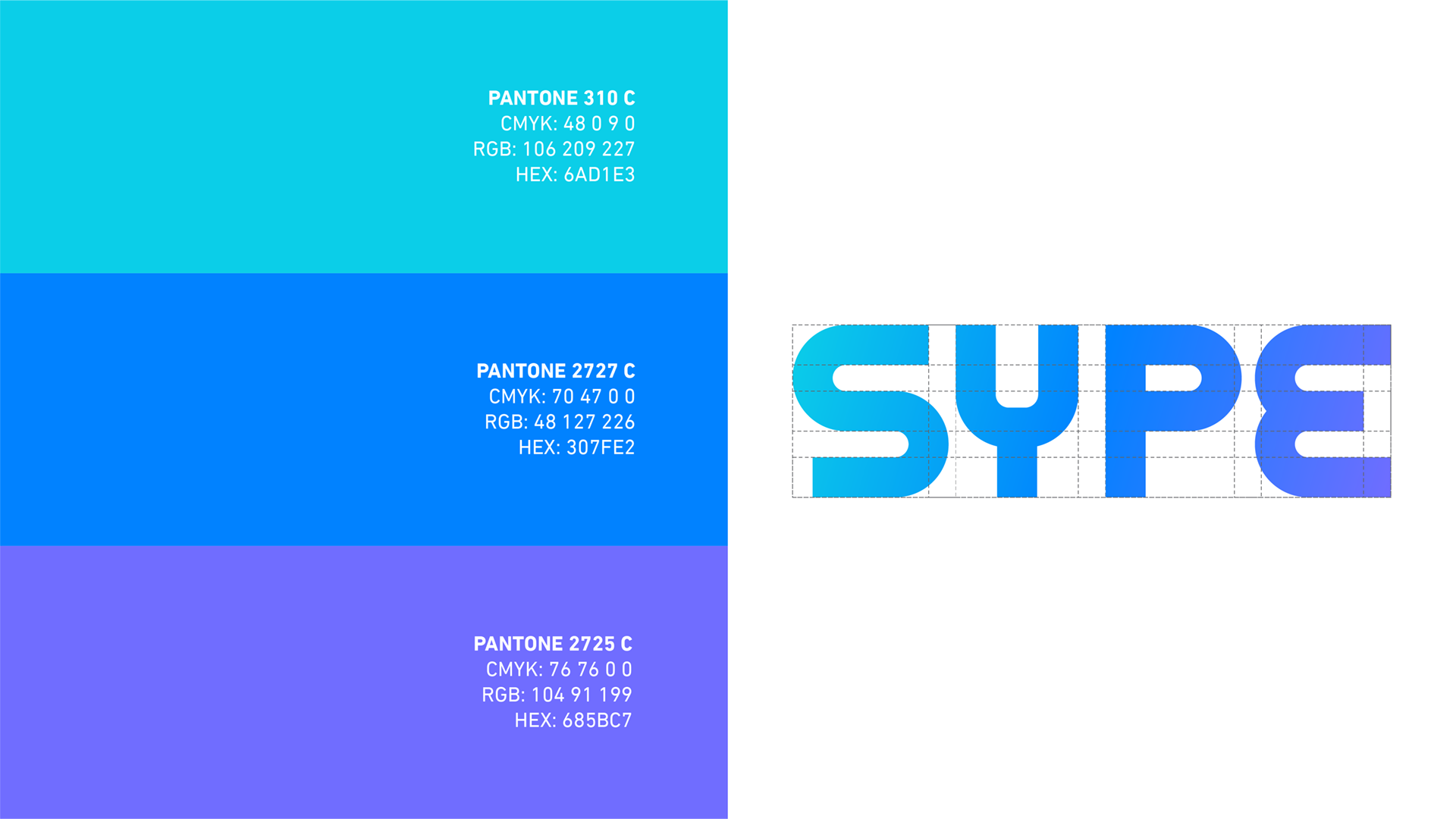
The Solution
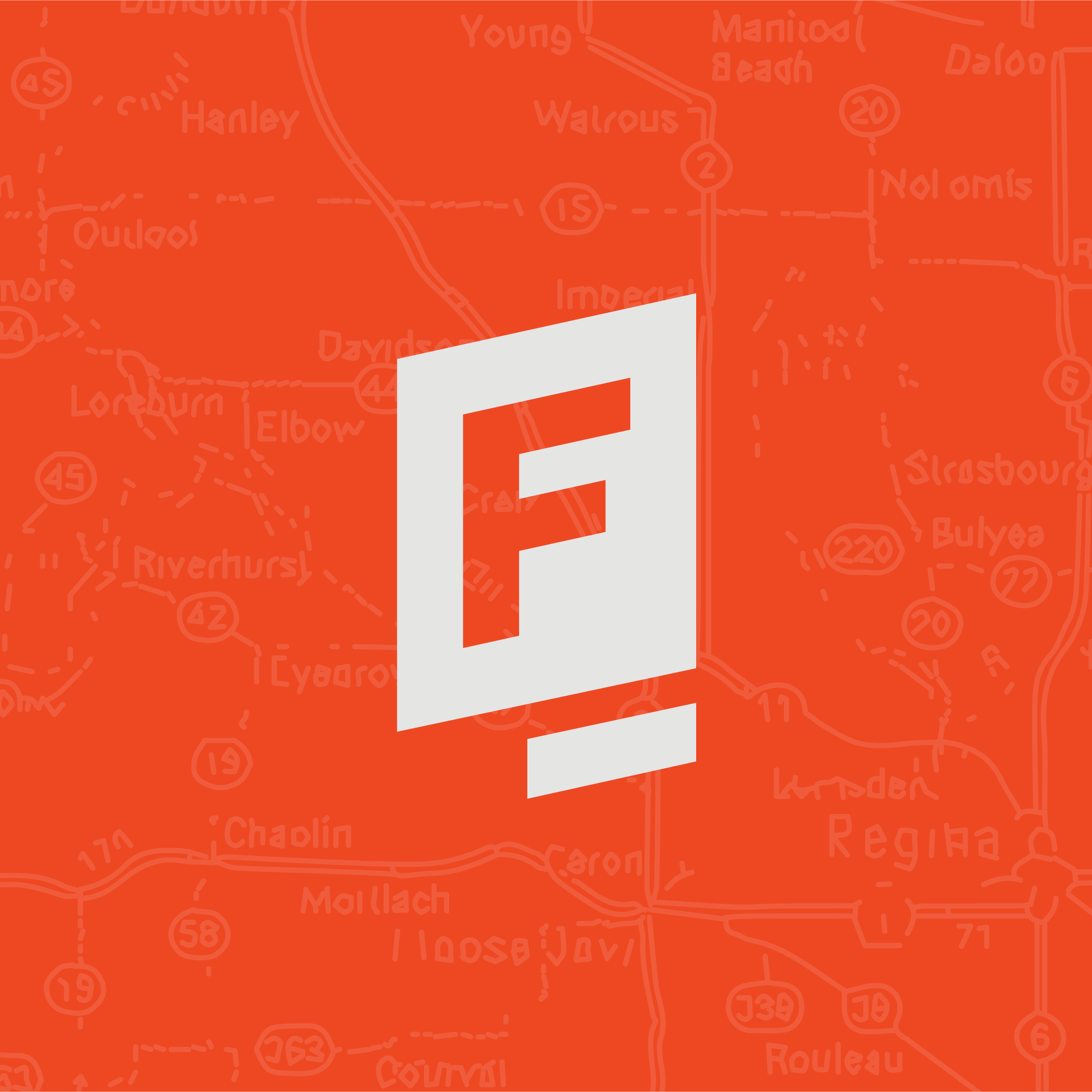
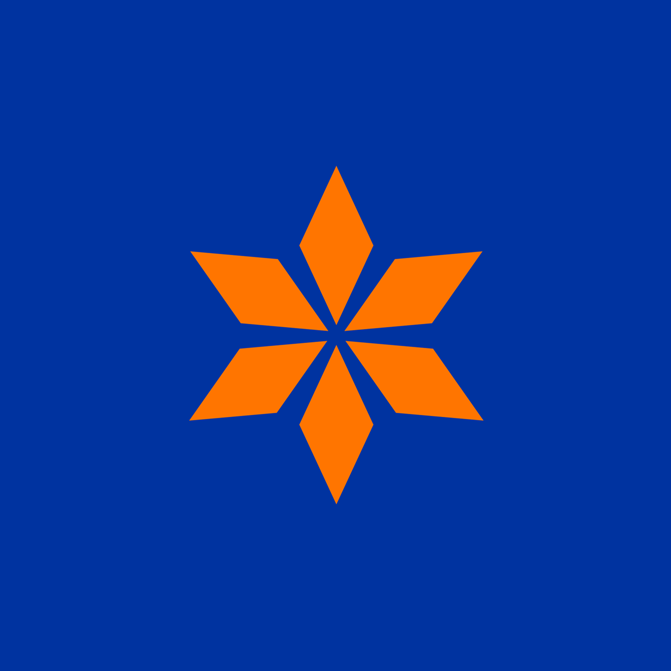
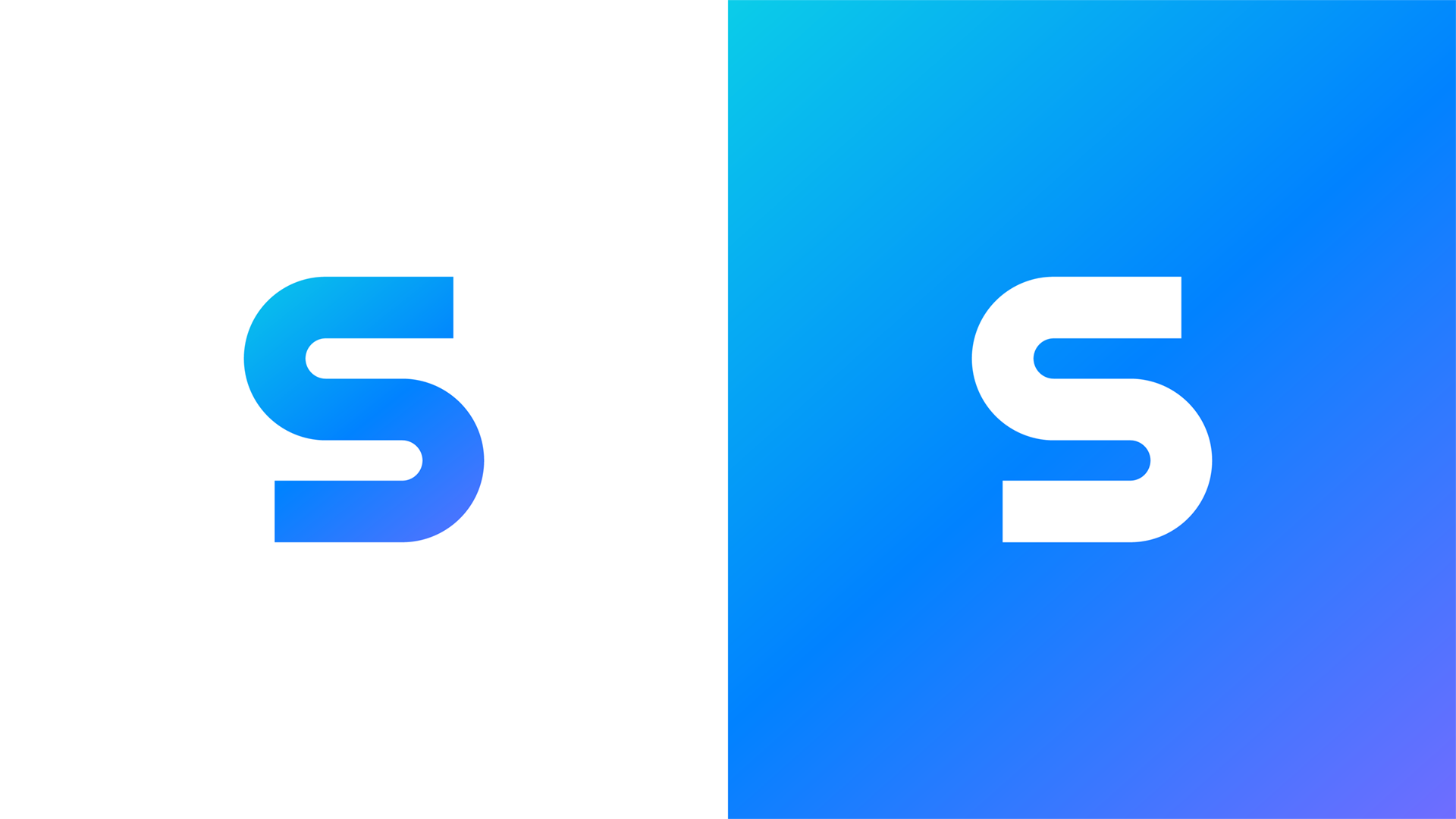
What do inspiring entrepreneurs do? They make waves.
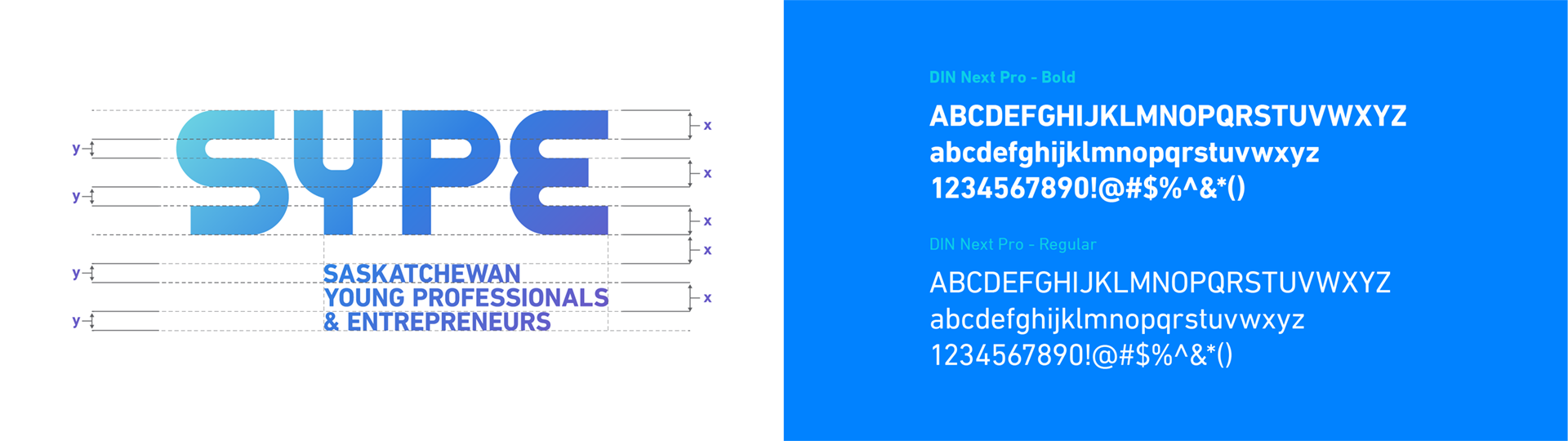
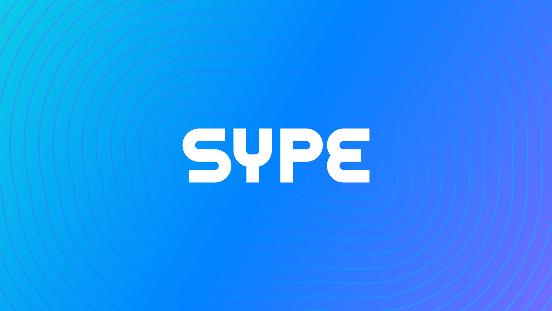
This was the guiding principle for the whole visual system. I wanted to combine that wave idea with a visual representation of the path that every small business person chooses to walk down. From there the custom typeface and "S" was born.
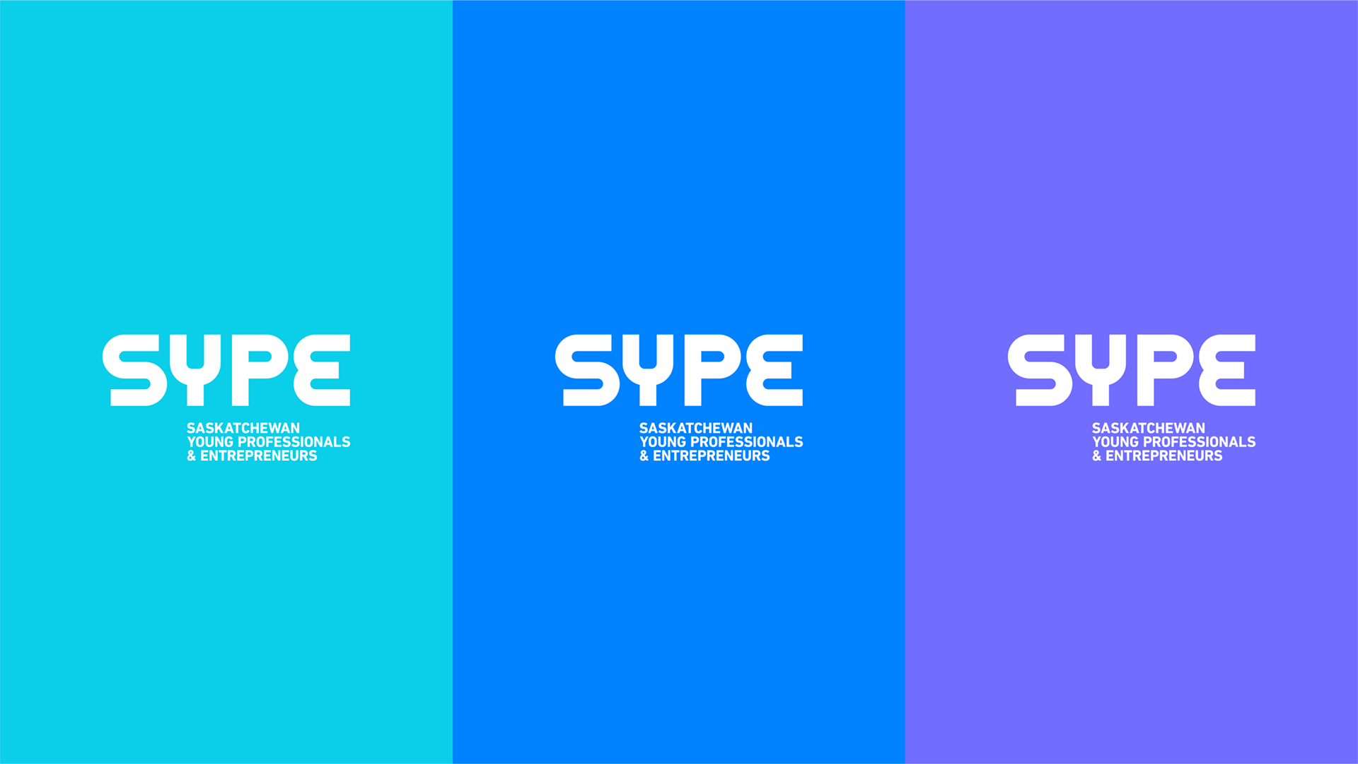
Next we built an easy type structure and colour system that could be replicated and executed across all the platforms the client needed.