The Brief
In a crowded industry, standing out is important. That was the guiding principle of this project. The client needed a mark that was clear, had a quirky personality and was easy to build a full visual system around.
The Audience
Fashion forward women from millennial to middle-age.
The Solution
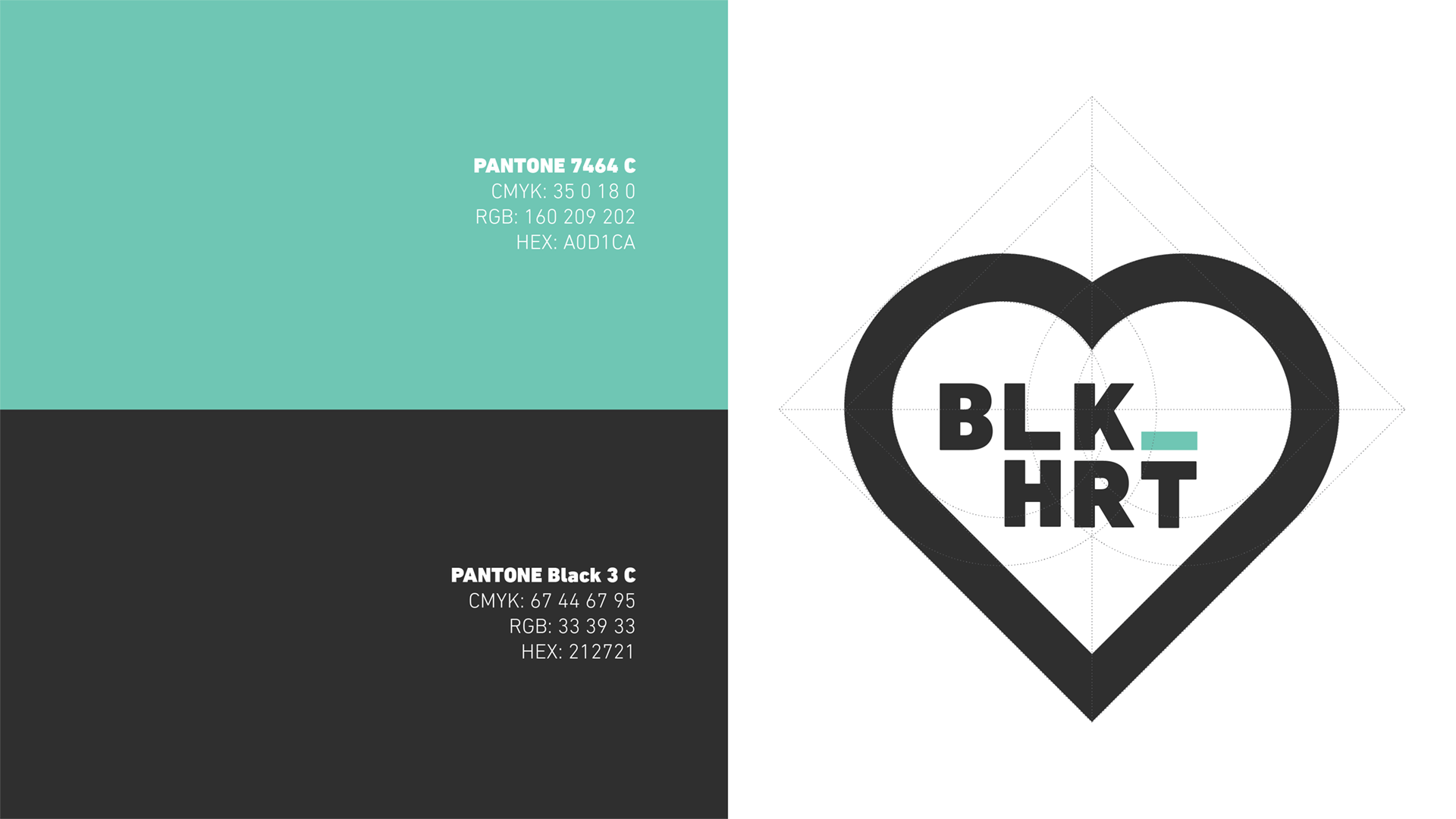
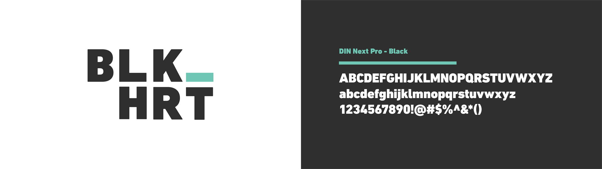
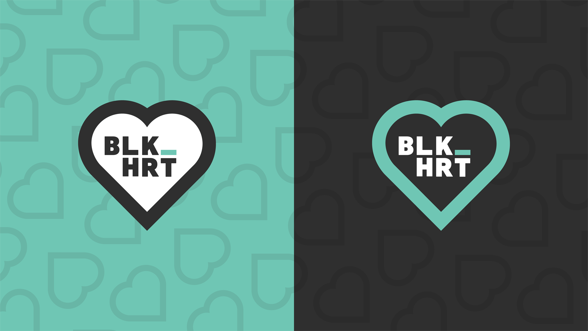
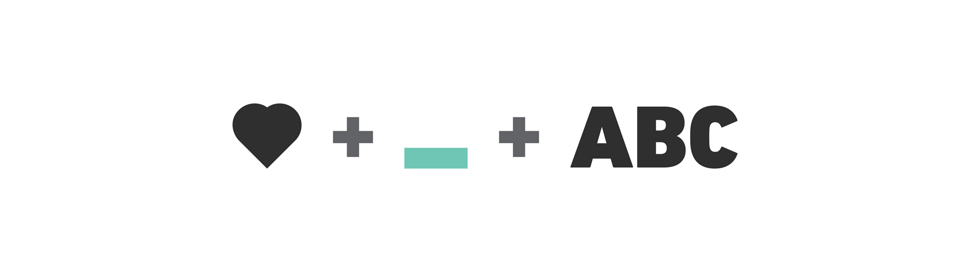
It all started with the name “BLK HRT” (pronounced Black Heart). With a name that plays with typography like this one does, the decision was made to go literal for the shape of the logo and focus on clean letterforms. Containing the type in the black heart shape not only creates a pleasing form, but reinforces the readability of the logo.
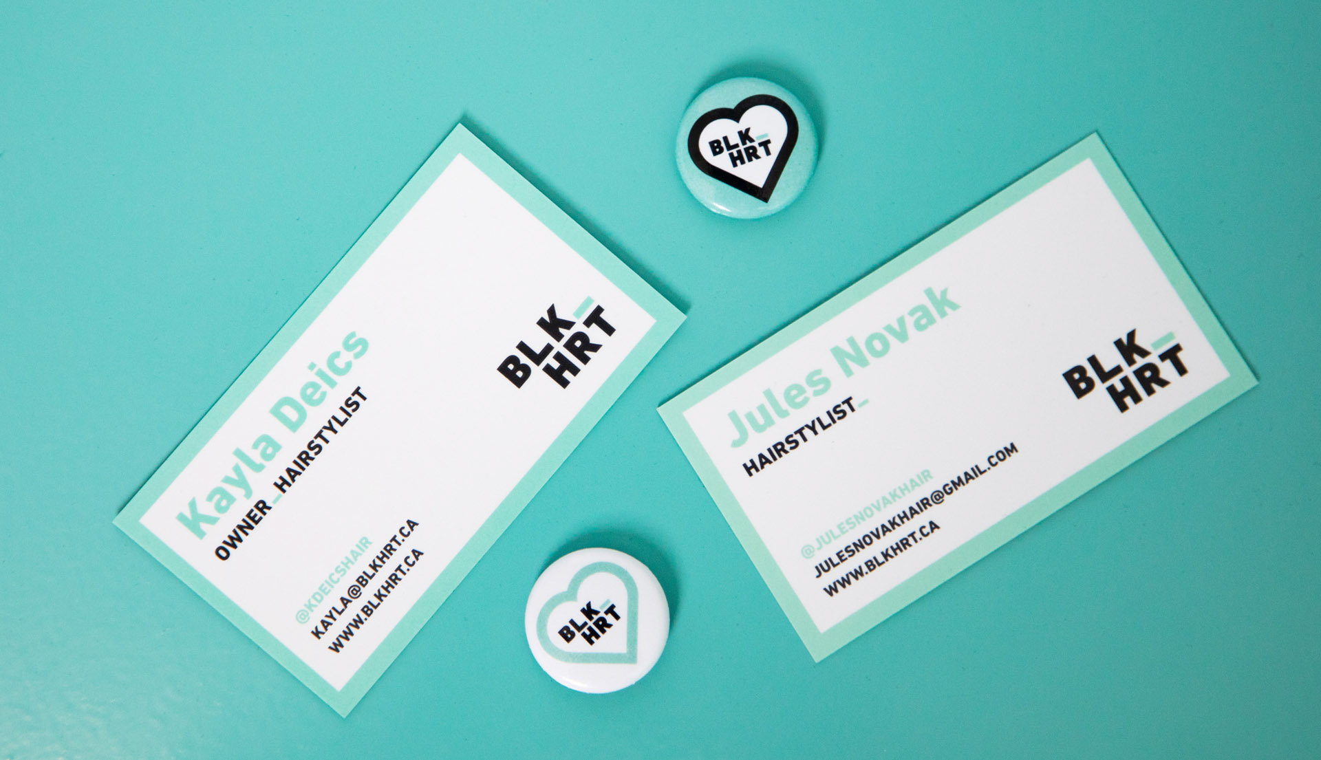
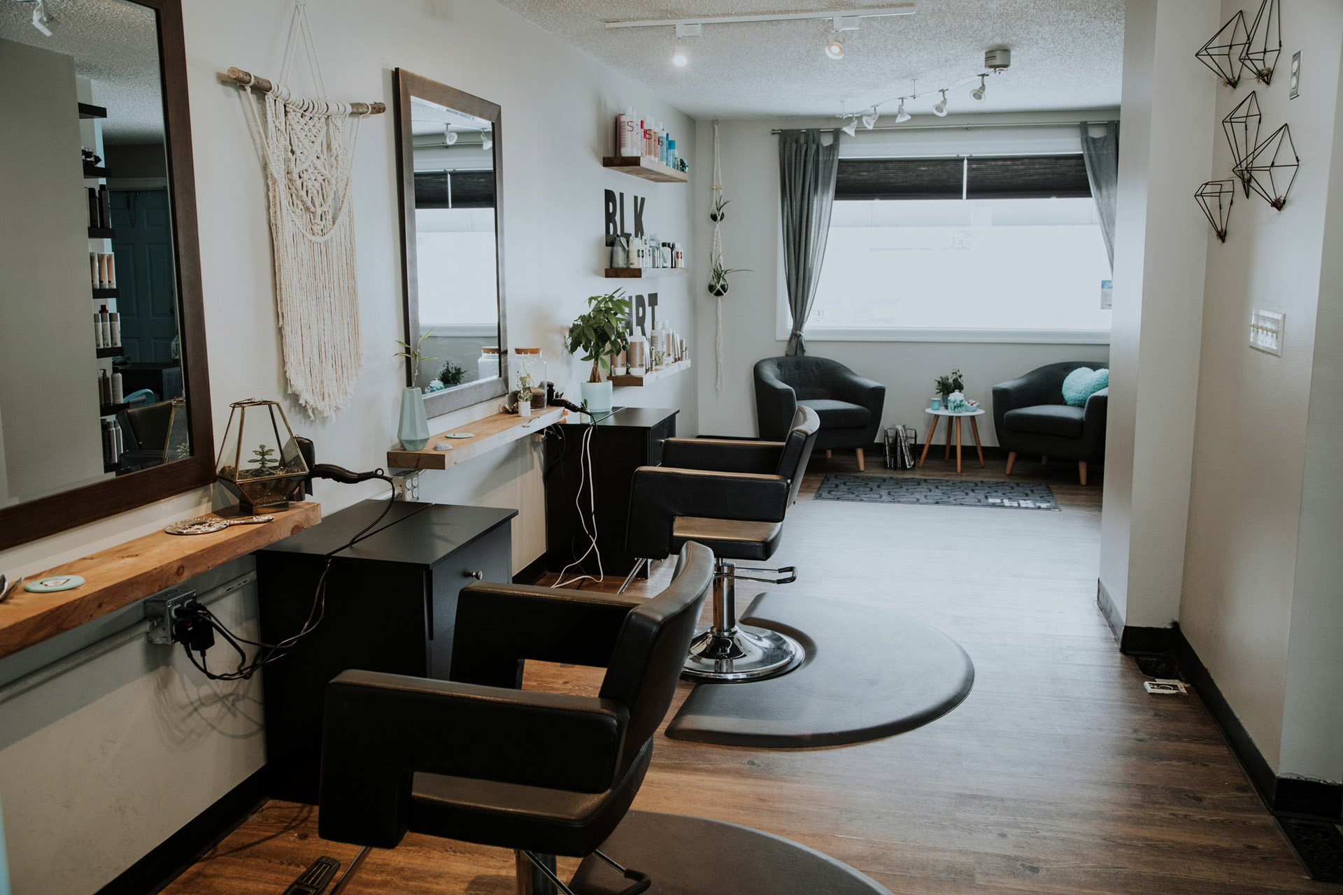
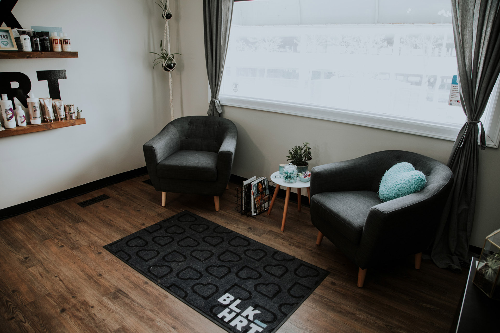
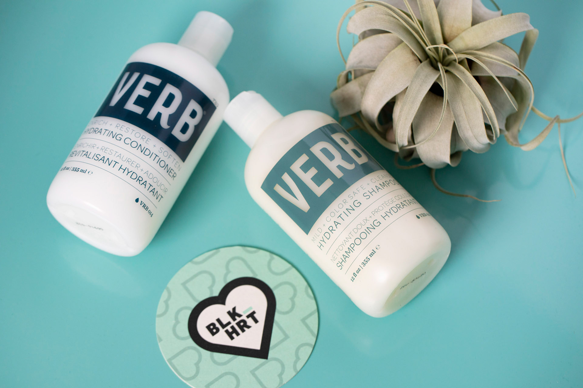
From there a visual system was built, all stemming from the bright teal and elements from the logo. Every inch of the collateral and interior space is rife with callbacks to the logo, be it through colour, form, shape or feeling.