The Brief
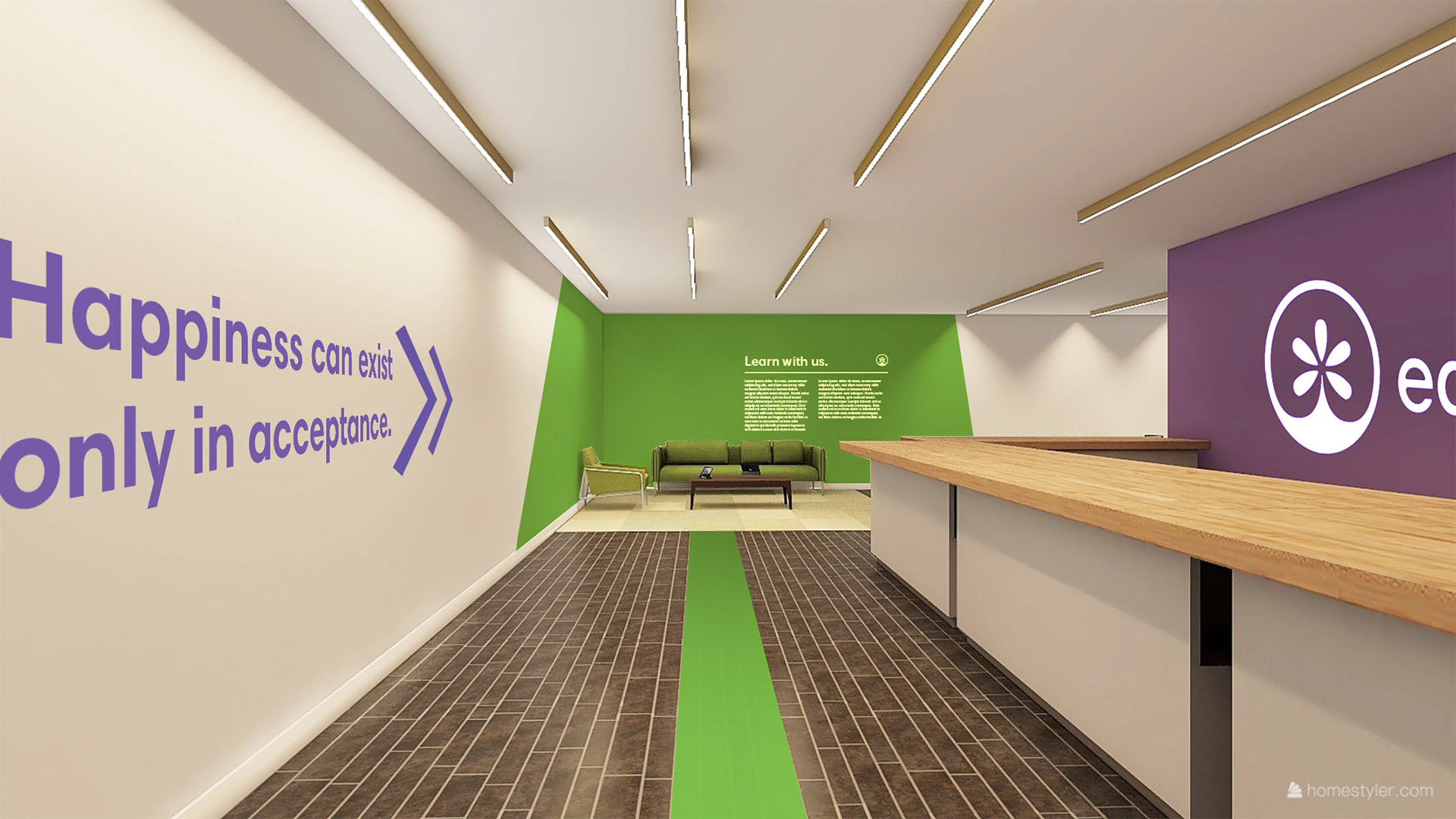
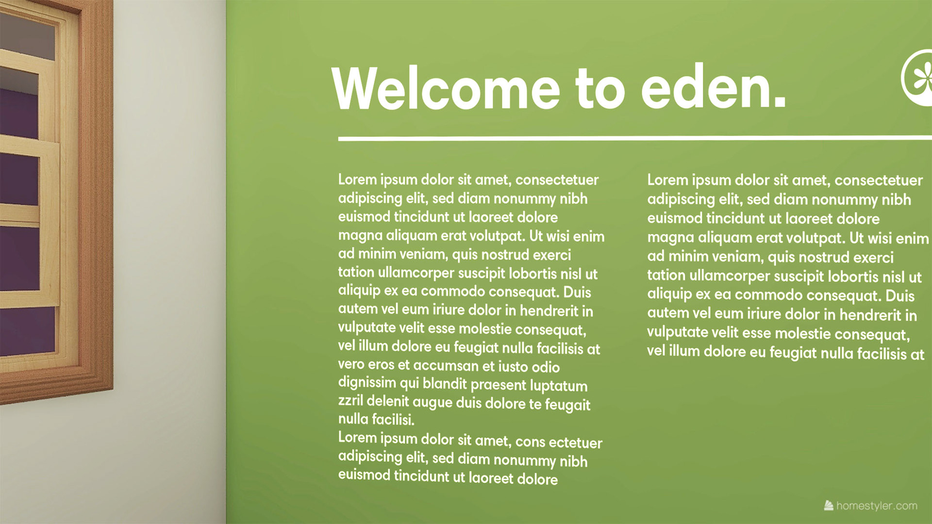
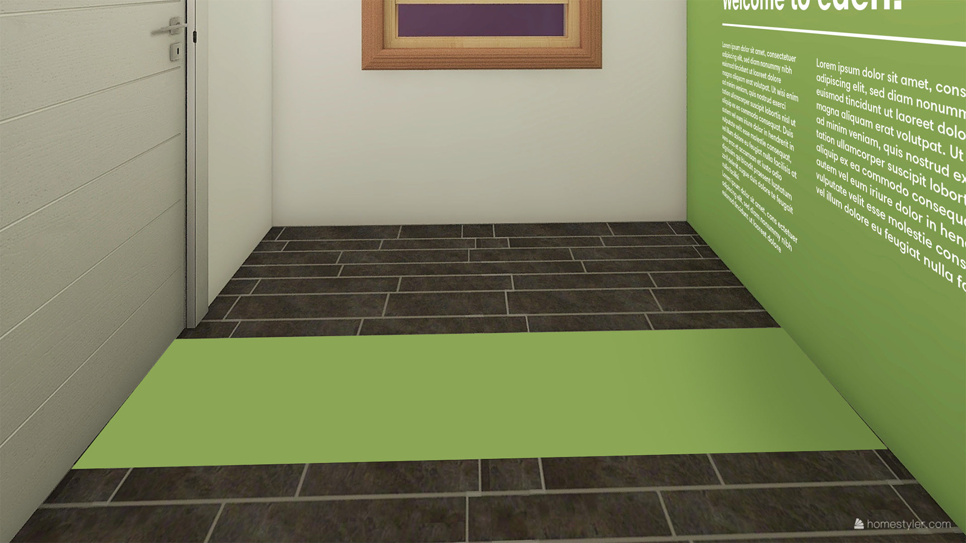
Working to design for an entirely new product category is something, as designers, we rarely get to do and for this project that was the challenge. The goal was to create a brand and space that was bright, welcoming and warm to accommodate customers and make them as comfortable as possible in this new market.
The Audience
Customers new to the cannabis space, who abstained before legalization.

The Solution
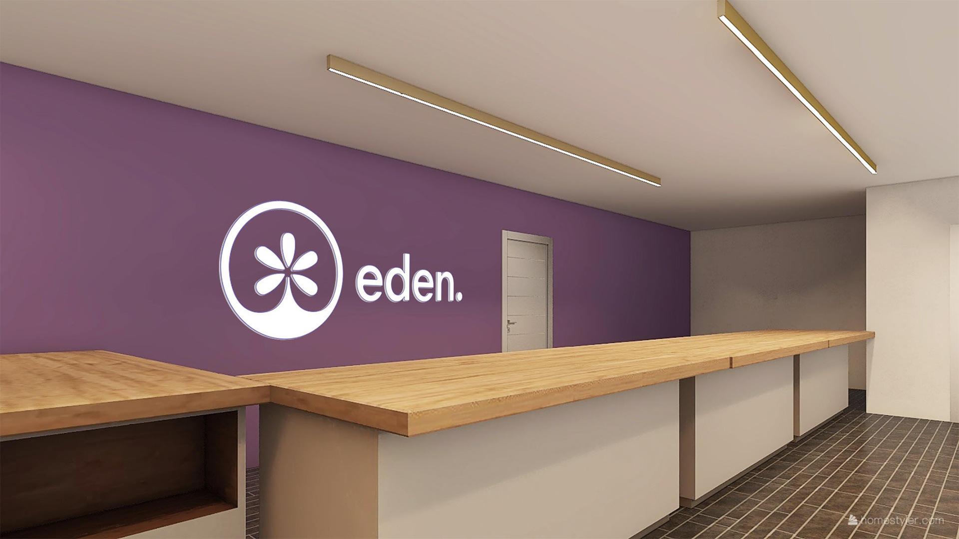
We had to first define what was core to cannabis culture as it existed before legalization and then decide that we wanted to keep and what needed to go. Professional, Clean and Clear were our guiding principles and the rest was derived from there.
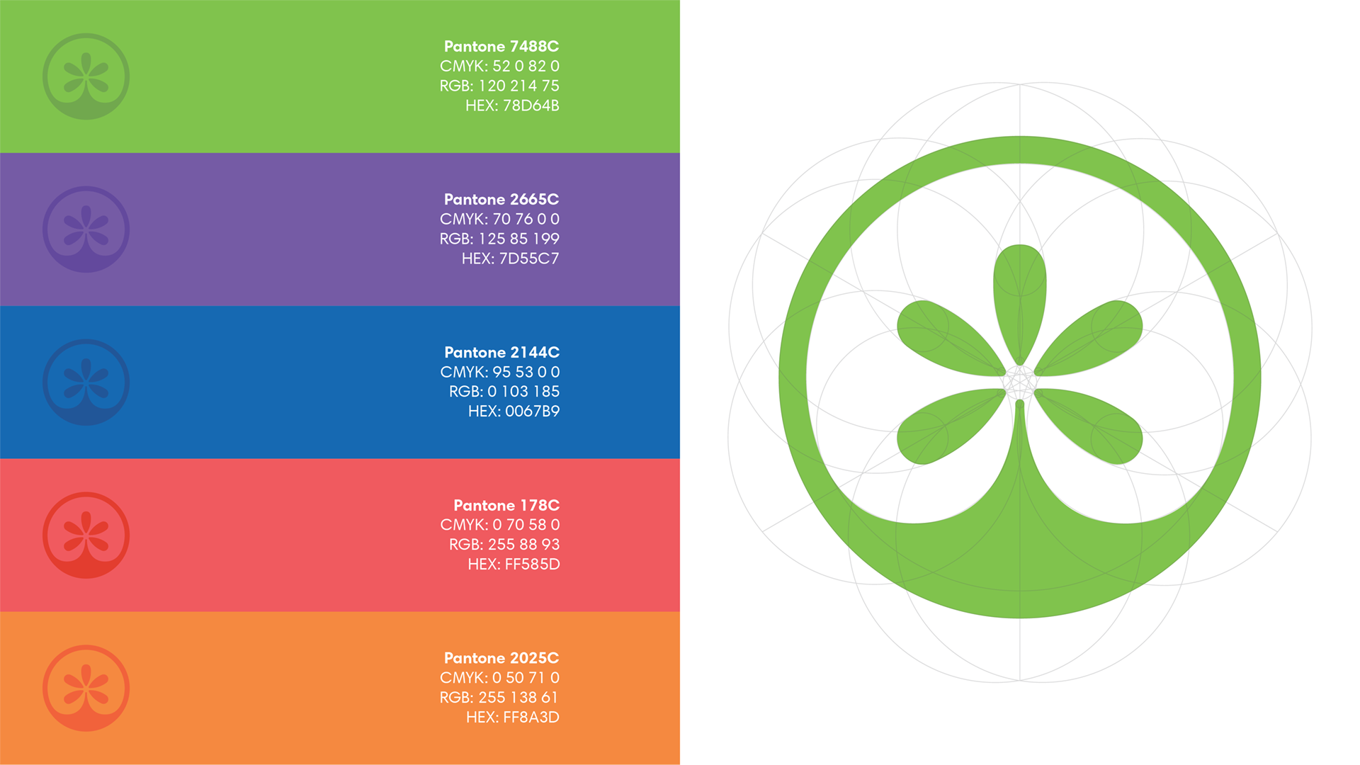
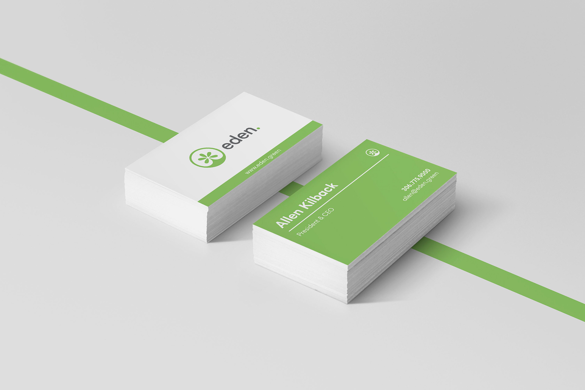
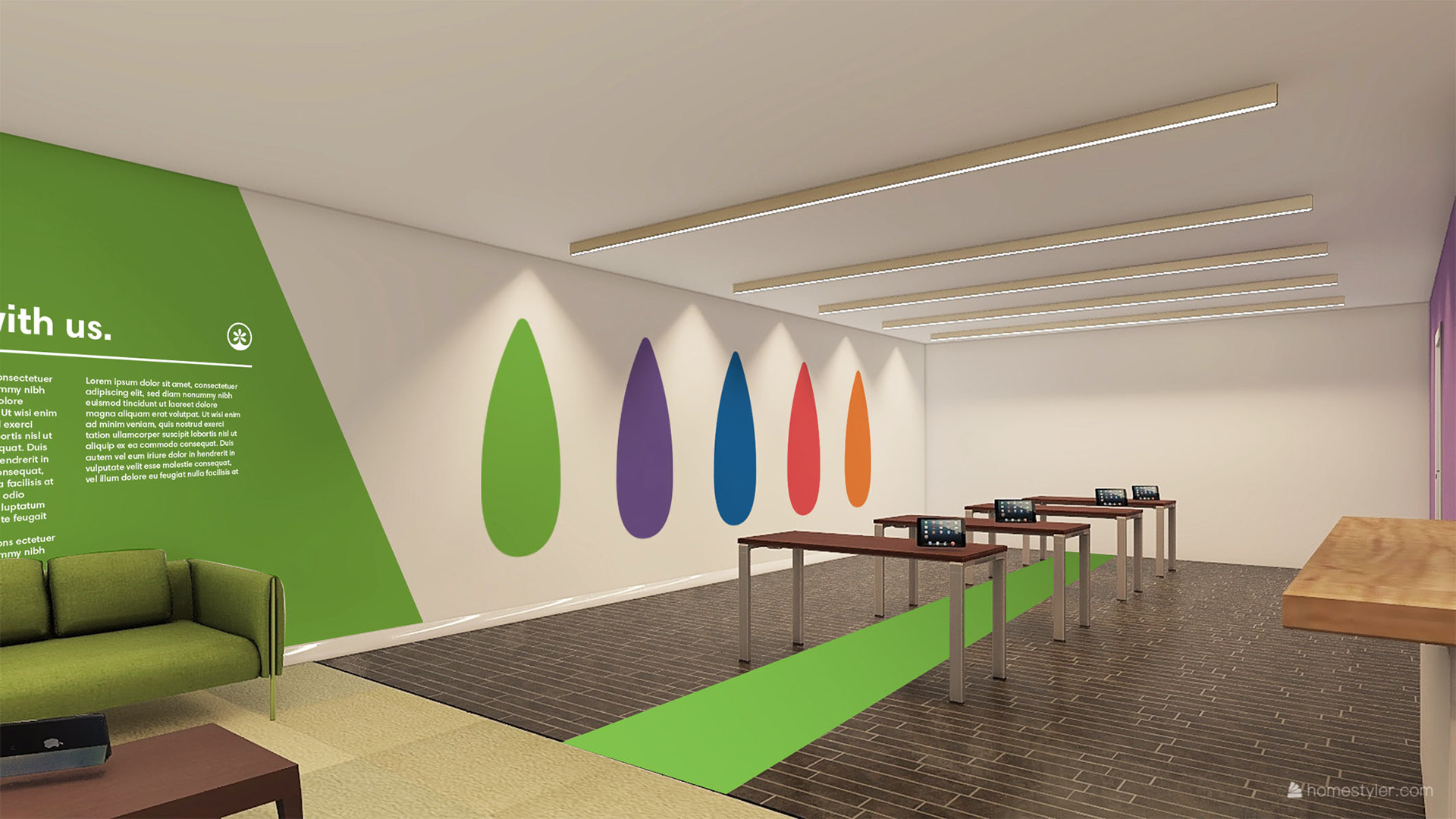
The mark was created to resemble the leaf, but the whole thing was softened down and moved into a continuous circle shape. The graphic also hits at a growing motion, as well as a sunrise and even the seeds of a split apple. Green was selected as the primary colour, for obvious reasons, and we build a bright and vibrant colour palette around that to give the branding items several options.
All graphics and branded items pulled from that same set of principles, as shown below.